FEAR OF GOD ESSENTIALS × UNION Vintage Tee Vintage "Army"
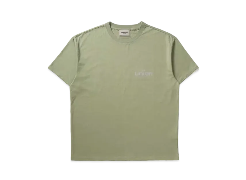
FEAR OF GOD ESSENTIALS × UNION Vintage Tee Vintage "Army"
The Fear of God ESSENTIALS × Union Vintage Tee in the "Vintage Army" colourway is more than just a t-shirt—it’s a tactile intersection of Jerry Lorenzo’s refined streetwear language and Union Los Angeles’ unparalleled eye for archival authenticity. Dropping as part of the Fall/Winter 2021 season, this piece immediately signals its intentions with a deeply saturated, washed-out olive green that feels as if it’s been pulled straight from a forgotten footlocker. The colour sits at the very heart of the design, a muted, earthy army tone that gracefully balances between sage and fatigue green, softened by an all-over garment dye and enzyme wash. It’s a shade that avoids crispness entirely, instead embracing a dusty, almost sun-faded character that means no two pieces will age exactly the same. The silhouette is unmistakably ESSENTIALS: a relaxed, boxy fit cut from a substantial heavyweight cotton jersey. This isn’t a flimsy basic. The fabric is dense and structured, with a dry hand feel that speaks to its vintage inspiration. The crew neckline is set with a ribbed collar that holds its shape without constricting, while the slightly dropped shoulders amplify that nonchalant, oversized drape. The hemline sits at a classic length, left raw or with subtle cover stitching to mimic the worn-in softness of true surplus. Every aspect of the construction is engineered to feel broken-in from the very first wear, like a tee you’ve owned for a decade. Where the collaboration truly combusts is in the graphics. The front chest print is a masterclass in understated co-branding. A crackled, deliberately distressed ESSENTIALS wordmark sits in thin, collegiate-style lettering, applied with a puff ink technique that has been intentionally degraded so it appears flaked and vintage. Below it, or perhaps cascading across the back, the Union logo is integrated—often rendered in a matching tonal olive or a faint metallic gold that references military insignia, though here the graphic treatment stays monochromatic to the vintage army palette. The print texture is crucial: it’s rough to the touch, with a crackled, peeling aesthetic that mimics the decay of a 1970s screenprint. Small, barely perceptible flecks of the ink having “dislodged” over time are part of the design, reinforcing the archival military concept without slipping into costume. Details pull the narrative together. A woven label at the nape fuses the ESSENTIALS rubberised patch with Union’s historic typeface, while the inner neck taping is left exposed, adding a raw utilitarian finish. The shirt’s heavy wash also means that


